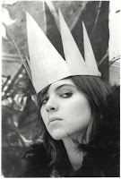
 He's the bear King!
UPDATE TIME

Whew! Now that Halloween's gone, I can get back to posting some long-due artwork. Digital quickie done in roughly 5 minutes of Danielle, sleeping on the couch with Shanti in front of the FearFest countdown.
Also, I'm super pissed because apparently I deleted all but the black and white tiff of the old Constitution Day image files. So I don't have the high quality files left, not even the psd. URGH.
Sita Character Design

Assignment in Adv. Character Design: I'm part of the group assigned to design characters for an imaginary game about the Ramayana as a space opera. These are some color variations on my interpretation of Sita, Rama's wife. See more concepts HERE
TIME Cover
Constitution Day Response
Spacemen
 First short in my Sequential Arts class this fall! I like how it turned out. The assignment was to do a four-panel short where the phrase "this isn't going to work" was the only dialogue allowed, and only in one of the four panels. The concept was to portray a certain mood. I had a hell of a time figuring out how to get a decent screentone, and am still amazed that I cannot seem to find actual screentone brushes for photoshop. Inked with a brush, and then colored in CS4.
Tattoo?

Direct linking failed... Here's a small drawing. Originally for practicing painting tattoos, but only after I rendered the skin did I realize that the original resolution was too small to do any fine details, so after a few tries I gave up. I'll just have to learn how to paint tattoos the original way....or the Shawn Barber way? Time will tell.
Concept art: Monster

So here's what I've been working on. A pretty big file, full sized. Here's a smaller preview. I'm pretty happy with how it's going. Sorry for the washed out color, I've figured out what's making that happen, more or less, but haven't yet found a way around it.
Also, I'm totally getting a website made! View my progress HERE
My super awesome friend Robin has been helping me set this up, she's great at webdesign. Let me know if you want her contact info!
Illustration Friday: Breakfast
Hey again people! Just got back from Florida. Here's my (first ever!) submission for this week's IF topic, breakfast. I am beginning to think that maybe I should be calibrating my screen display settings or something, because I am still having this problem where when I upload anything at all (or save as a bmp) my images lose saturation drastically and are dulled down significantly. I'm not terribly torn up about this one though, because it gives the piece a slightly faded, old-timey diner look but NONETHELESS. Someone help me figure this out! Is it CS4? Is it just web colors being web colors? Is it my display settings? Is it something about how I am saving or uploading these images??? Assisstance would be preferred.
Also, comments. Thanks!
Also, comments. Thanks!
Mickey!

Hello, boys and girls. Here I have a personal piece that I started about two weeks ago. I was experimenting with a different coloring method in photoshop that will give a much cleaner, more graphic look to my work. Actually quite happy with how this turned out. I worked on and off, every once in a while as a break from doing commissions and stuff. I was inspired after watching Gaga's Alejandro video and finding some random picture of a Mickey Mouse halloween costume on tokyodandy.com.
My girlfriend Ashley did a parallel piece of Minnie, here!
Portrait of Allison
comic: "See No Evil"
SPACE JAIL


Space Jail was a pseudo parody collaborative effort by the MICA sequential arts club, about the events surrounding an intergalactic Repo-man named Vlad and his adventures abroad a Galactic maximum space prison. Read more about it at the space jail blog.
My sections above were both two pages each, the bottom ones being the intro and the two on top are a separate scene.
The linework is pencil and the shading is awful photoshop work, so I'm going to redo those later on probably.
Radiolab!
Finally! The first assignment that I am really quite fond of from Illustration 2. Struggled unbelievably hard with this one. Debating whether or not to put the Radiolab logo in there.
My subject was Morality. I will add to this post later to explain when I've had some sleep, maybe.
My subject was Morality. I will add to this post later to explain when I've had some sleep, maybe.
Juicy, delicious slabs of meat.
Okay, so this is the first piece I am at all proud of from this semester.
The idea was to create an organic alphabet for Hand Letters that draws from something found in nature. I was mildly annoyed by this until Chris suggested I do meat. Sexy, sexy slabs of MEAT.
Naturally, I was enthused. I painted the alphabet in acrylic and then created a poster to advertise the release of a fictional book. Holy gods I hope Virginia Temple isn't a real author.
Props to Maria for modeling her beautiful self.
Silver


Hey everyone! I just scanned and cleaned up a bunch of 35 mm silver gelatin prints from first semester's Basic Photo with Lesly Deschler Canossi, who is an amazing professor, by the way. Really enjoyed the class. The set above is a mix of work from a couple of different projects, one of them being my final for the class. Props to Amanda for modeling on that one

 This here is a photo of the backdrop I made for my final. I made sure during the planning stages that I would be able to use it both vertically and sideways as a backdrop. The whole ink drawing was about 6 feet by 11 feet, on cut Lennox. Big thanks to Chris for all the help! To the right is my favorite picture out of the set I did of Madison. Love that girl.
The God In The River REVISED
The God In The River
Awwwww hells YES.
So I've been working on this piece for like, an entire week, just to polish it up for scholarships and for Society of Illustrators. Here's the original ink and graphite, versus the final colored piece. This looks nothing like what I did in class.

 This illustration was a non-literal interpretation of a remix of "My Sweet Shadow" by the band In Flames. I listened to the song, and wrote down what I heard instead of the actual lyrics, and then used the images I came up with as a spring board for that. The actual process was more complicated, but that's it in a nutshell.
So I've been working on this piece for like, an entire week, just to polish it up for scholarships and for Society of Illustrators. Here's the original ink and graphite, versus the final colored piece. This looks nothing like what I did in class.

 This illustration was a non-literal interpretation of a remix of "My Sweet Shadow" by the band In Flames. I listened to the song, and wrote down what I heard instead of the actual lyrics, and then used the images I came up with as a spring board for that. The actual process was more complicated, but that's it in a nutshell.
Don't Play With Your Food
Subscribe to:
Comments (Atom)


